Miro Canvas
Jun 2022 - Feb 2023
Widgets interactions on canvas
I joined the Canvas Frameworks team in 2022 to focus on the experience with visual elements on board, specifically images.
My interest and involvement into Canvas started with my participation in a hackathon (where our team won CEO award for our navigation with connection lines).
I am very enthusiastic about streamlining routine workflow, improving internal processes, implementing tiny improvements with big impact faster. When the new team had formed I was eager to join them: 3 front end developers, EM and PM
Goal
Increase business metrics and usage of the most commonly used widget type. Reduce UX friction. Eliminate significant pain points.
My Responsibility
Own anything related to Image widget on Canvas
Discover existing pain points and community requests
Competitors landscape research
Customer journey and behavior mapping to leverage all consistent, dependand functions
Build information architecture for widgets actions
Audit mapping
Maintaining design backlog with high level roadmap
Participation in evaluation of feature roadmap
Research
Surprisingly almost half of the users inserted images via clipboard pasting. Big mass relied on using hotkeys, ignored the toolbar in selection mode, or waited for reading the tooltips explaining what the action would mean. Lots of users asked for adding shadows (borders) to distinguish image content from the background. Lots of ux friction were caused by real life pixel image dimensions that were not relevant to current zoom level The concept of cropping and applying masks at the same time was hardly discoverable.
Measure of Success
We used Amplitude for analytics events data when running new experiments, users feedback (internal and external), design critique sessions.
Key Deliverables
Detailed specs describing solution in tech details
Screen recordings of desired behavior, GIF or video (loom) format
Screen Flows
Competitors analysis
User research reports
Actions audit tables
Opportunity solution trees
Beautiful Basics
Image loading indication update
Problem
After adding images users often closed Miro tab without noticing that the upload wasn't finished, so they needed to be informed about the loading process. Downloading indicator overlapped the whole content and didn't meant to indicate the estimated download time, looked outdated and just ugly on scales.
Hypothesis
If we put a contrast label for an upload, instead of custom semi-noticeable spinner on top, and distinguish download and upload progress indicators, users will have more understanding of what's happening on board.
Solution
Instant film fade in effect when downloading image to imitate smooth loading. Uploading indication that is contrast enough but does not cover the content.


2 POV: Image Uploader and Viewer
Make GIFs (auto-)playin experience more fun
Problem
"GIFs add a ton of magic to the presentation of boards..."
"My boss forgets to click play and then it’s just awkward in presentations"
Play button overlaps too much content. After pressing it takes too much time to preload the animation. GIFs are almost useless in presentation mode and for adding funny animated reactions.
Process and Solution
Identified 2 main use cases: reactions in sync collaboration and visual asset (can be screencast with subtitles).
Preload GIF if it's in viewport (following set of rules to start lazyload)
Autoplay when anyone uploads GIF
Autoplay on hover GIF in viewport


Loading and playing GIF, before and after
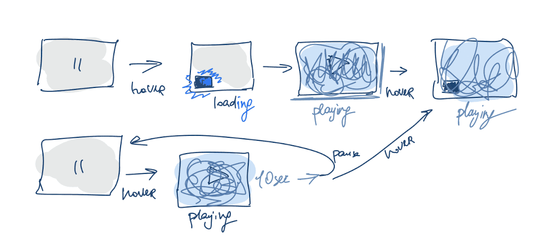
Image ALT text
Problem
One of important improvements that allowed screen readers to read image descriptions aloud for people with visual impairments.
Solution
Systematic behavior pattern used in adding link to text. Defining concept of "description" not "captioning" picture on canvas.
Working with a11y team.

Too many buttons
Problem
As one of key takeaways from qualitative research studies, multiple interviews in the process and user complains were that we users barely rely on iconography as its incosistency destroys spatial memory, hardly readable. Some crazy corner cases presented below.


Solution
The AI of widgets actions was touching all canvas widgets. I described the most popular first. Text based: stickie note, text widget, card, shape. Content based: image, gif, pdf, document, embed. Containers: frame, group, kanban board, table.
Created structured Information Architecture and a guideline for adding new toolbar actions. Applied the “Less is more” principle. Effectively communicated principles of the widgets actions rules and patterns.


Widget right click (meatballs) menu before and after.
Outcomes
Toolbar redesign project owned by another team and I'm patiently waiting for their update.
Fast and intuitive layouts
Problem
Analysis showed that users tend tend to scale down image content when working on small zoom levels and scale up on > 20% zoom level. Zoom level changed automatically after the insertion of images bigger than the viewport, with that, changing the user behavior and working zoom level.

Solution
Reduce the number of unwanted actions by encouraging users to work on realistic 100% zoom level. Less zooming in and out. Less content resizing.
Auto fitting image into viewport (if the real pixel size is too large). Adding and replacement content behavior updates.
User tests. Interviews. Expectation testing.

Image templates filling via drag and drop.
Crop masks and Match size in bulk
Solution
As an extension for single image "Resize" and "Apply Mask" actions.

Matching size of selected objects.

Multiple images circle mask.
Image background removal with AI
Problem
Everyone is obsessed with AI and we want to be trendy
Solution
Image AI background removal integration.

Image templates filling via drag and drop.
Summary
Experience working in B2C with lots of experiments, data, and lots of user testing was somewhat new for me. I learned a lot about cross functional and horizontal collaboration, technical limitations of the Canvas, and most important, what it's like to be part of a great team 🤘 🎸